Scatter plot
[4][5] While Edmund Halley created a bivariate plot of temperature and pressure in 1686, he omitted the specific data points used to demonstrate the relationship.
[4] Sir Francis Galton extended and popularized the scatter plot and many other statistical tools to pursue a scientific basis for eugenics.
[4] Karl Pearson, R. A. Fischer, and other statisticians and eugenicists built on Galton's work and formalized correlations and significance testing.
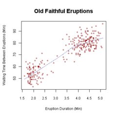
[citation needed] A scatter plot can suggest various kinds of correlations between variables with a certain confidence interval.
A scatter plot is also very useful when we wish to see how two comparable data sets agree to show nonlinear relationships between variables.
[citation needed] A person with a lung capacity of 400 cl who held their breath for 21.7 s would be represented by a single dot on the scatter plot at the point (400, 21.7) in the Cartesian coordinates.
[citation needed] A generalized scatter plot matrix[11] offers a range of displays of paired combinations of categorical and quantitative variables.
A mosaic plot, fluctuation diagram, or faceted bar chart may be used to display two categorical variables.