International Typographic Style
[1][2] It expanded on and formalized the modernist typographic innovations of the 1920s that emerged in part out of art movements such as Constructivism (Russia), De Stijl (The Netherlands) and at the Bauhaus (Germany).
[3] The International Typographic Style has had profound influence on graphic design as a part of the modernist movement, impacting many design-related fields including architecture and art.
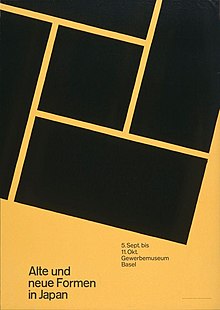
[4] Hallmarks of the style are asymmetric layouts, use of a grid, sans-serif typefaces like Akzidenz Grotesk and Helvetica, and flush left, ragged right text.
The International Typographic Style evolved as a modernist graphic movement that sought to convey messages clearly and in a universally straightforward manner.
Univers paved the way for Max Miedinger and collaborator Edouard Hoffman to design the typeface Neue Haas Grotesk, which would be later renamed Helvetica.
The format of the journal represented many of the important elements of the style—visually demonstrating the content—and was published internationally, thus spreading the movement beyond Switzerland's borders.
One of the editors, Josef Müller-Brockmann, "sought an absolute and universal form of graphic expression through objective and impersonal presentation, communicating to the audience without the interference of the designer's subjective feelings or propagandist techniques of persuasion.
After World War II international trade began to increase and relations between countries grew steadily stronger.
Typography and design were crucial to helping these relationships progress—clarity, objectivity, region-less glyphs, and symbols are essential to communication between international partners.
Suprematism, which arose in 1913, is another Russian art movement similarly focused on the simplification and purity of geometric forms to speak to values of spirituality.
All of these movements including the International Typographic styles are defined by reductionist purity as a visually compelling strategy of conveying messages through geometric and color based hierarchies.
The movement was structured by focusing on detail, precision, craft skill, systems of education and approach, technical training, high standards of print, and the innovative application of lettering.
Fonts chosen for the text are sans serif, a type style believed to "[express] the spirit of a more progressive age" by early designers in the movement[15] and focus on delivering content over embellishment.
[20] Objective photography is another design element meant to present information clearly, and without any of the persuading influences of propaganda or commercial advertising.