Data and information visualization
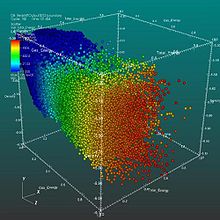
Information visualization, on the other hand, deals with multiple, large-scale and complicated datasets which contain quantitative (numerical) data as well as qualitative (non-numerical, i.e. verbal or graphical) and primarily abstract information and its goal is to add value to raw data, improve the viewers' comprehension, reinforce their cognition and help them derive insights and make decisions as they navigate and interact with the computer-supported graphical display.
Graphical items are well-chosen for the given datasets and aesthetically appealing, with shapes, colors and other visual elements used deliberately in a meaningful and non-distracting manner.
Effective information visualization is aware of the needs and concerns and the level of expertise of the target audience, deliberately guiding them to the intended conclusion.
[10][3] Such effective visualization can be used not only for conveying specialized, complex, big data-driven ideas to a wider group of non-technical audience in a visually appealing, engaging and accessible manner, but also to domain experts and executives for making decisions, monitoring performance, generating new ideas and stimulating research.
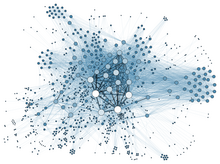
[12] The field of data and information visualization is of interdisciplinary nature as it incorporates principles found in the disciplines of descriptive statistics (as early as the 18th century),[13] visual communication, graphic design, cognitive science and, more recently, interactive computer graphics and human-computer interaction.
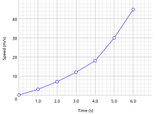
Numerical data may be encoded using dots, lines, or bars, to visually communicate a quantitative message.
According to Vitaly Friedman (2008) the "main goal of data visualization is to communicate information clearly and effectively through graphical means.
[25] Indeed, Fernanda Viegas and Martin M. Wattenberg suggested that an ideal visualization should not only communicate clearly, but stimulate viewer engagement and attention.
Edward Tufte has explained that users of information displays are executing particular analytical tasks such as making comparisons.
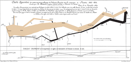
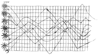
Six variables are plotted: the size of the army, its location on a two-dimensional surface (x and y), time, the direction of movement, and temperature.
This multivariate display on a two-dimensional surface tells a story that can be grasped immediately while identifying the source data to build credibility.
According to Tufte, chartjunk refers to the extraneous interior decoration of the graphic that does not enhance the message or gratuitous three-dimensional or perspective effects.
A human can distinguish differences in line length, shape, orientation, distances, and color (hue) readily without significant processing effort; these are referred to as "pre-attentive attributes".
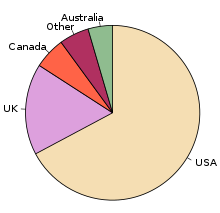
For example, since humans can more easily process differences in line length than surface area, it may be more effective to use a bar chart (which takes advantage of line length to show comparison) rather than pie charts (which use surface area to show comparison).
[39] Cognition refers to processes in human beings like perception, attention, learning, memory, thought, concept formation, reading, and problem solving.
[40] Human visual processing is efficient in detecting changes and making comparisons between quantities, sizes, shapes and variations in lightness.
Studies have shown individuals used on average 19% less cognitive resources, and 4.5% better able to recall details when comparing data visualization with text.
[43] Michael Friendly and Daniel J Denis of York University are engaged in a project that attempts to provide a comprehensive history of visualization.
Earliest documented forms of data visualization were various thematic maps from different cultures and ideograms and hieroglyphs that provided and allowed interpretation of information illustrated.
For example, Linear B tablets of Mycenae provided a visualization of information regarding Late Bronze Age era trades in the Mediterranean.
The idea of coordinates was used by ancient Egyptian surveyors in laying out towns, earthly and heavenly positions were located by something akin to latitude and longitude at least by 200 BC, and the map projection of a spherical Earth into latitude and longitude by Claudius Ptolemy [c. 85–c.
Figure shows a graph from the 10th or possibly 11th century that is intended to be an illustration of the planetary movement, used in an appendix of a textbook in monastery schools.
For this purpose, the zone of the zodiac was represented on a plane with a horizontal line divided into thirty parts as the time or longitudinal axis.
[43] Very early, the measure of time led scholars to develop innovative way of visualizing the data (e.g. Lorenz Codomann in 1596, Johannes Temporarius in 1596[49]).
French philosopher and mathematician René Descartes and Pierre de Fermat developed analytic geometry and two-dimensional coordinate system which heavily influenced the practical methods of displaying and calculating values.
Fermat and Blaise Pascal's work on statistics and probability theory laid the groundwork for what we now conceptualize as data.
[39] In the second half of the 20th century, Jacques Bertin used quantitative graphs to represent information "intuitively, clearly, accurately, and efficiently".
Munzner agues that visualization "is suitable when there is a need to augment human capabilities rather than replace people with computational decision-making methods.
Friendly (2008) presumes two main parts of data visualization: statistical graphics, and thematic cartography.
On the other hand, from a computer science perspective, Frits H. Post in 2002 categorized the field into sub-fields:[27][63] Within The Harvard Business Review, Scott Berinato developed a framework to approach data visualisation.


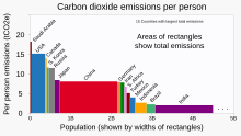
· population (along x axis),
· per-person emissions 1990-2018 (along y axis), and
· total emissions (area as x*y product of values)