Infographic
[2] Infographics have evolved in recent years to be for mass communication, and thus are designed with fewer assumptions about the readers' knowledge base than other types of visualizations.
[citation needed] In newspapers, infographics are commonly used to show the weather, as well as maps, site plans, and graphs for summaries of data.
Public places such as transit terminals usually have some sort of integrated "signage system" with standardized icons and stylized maps.
Such a map can be considered a "supersign" which combines sign systems—as defined by Charles Sanders Peirce—consisting of symbols, icons, indexes as representations.
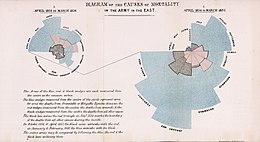
[15] In 1857, English nurse Florence Nightingale used information graphics to persuade Queen Victoria to improve conditions in military hospitals.
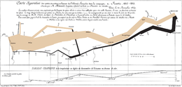
The graphic's creator, Charles Joseph Minard, captured four different changing variables that contributed to Napoleon's downfall in a single two-dimensional image: the army's direction as they traveled, the location the troops passed through, the size of the army as troops died from hunger and wounds, and the freezing temperatures they experienced.
James Joseph Sylvester introduced the term "graph" in 1878 in the scientific magazine Nature and published a set of diagrams showing the relationship between chemical bonds and mathematical properties.
[19] Gerd Arntz, Peter Alma and Augustin Tschinkel, all participants in this movement were recruited by Otto Neurath for the Gesellschafts- und Wirtschaftsmuseum, where they developed the Vienna Method from 1926 to 1934.
Following the victory of Austrofascism in the Austrian Civil War, the team moved to the Netherlands where they continued their work rebranding it Isotypes (International System of Typographic Picture Education).
In 1942 Isidore Isou published the Lettrist manifesto, a document covering art, culture, poetry, film, and political theory.
The diagram contained six interrelated components used for analyzing arguments and was considered Toulmin's most influential work, particularly in the field of rhetoric, communication, and computer science.
The pictorial messages included nude male and female figures as well as symbols that were intended to provide information about the origin of the spacecraft.
[20][21][22] Referred to by The New York Times as the "da Vinci of Data", Tufte began to give day-long lectures and workshops on the subject of infographics starting in 1993.
Tufte's contribution to the field of data visualization and infographics is considered immense, and his design principles can be seen in many websites, magazines, and newspapers today.
Likewise, the staff artists at USA Today, the United States newspaper that debuted in 1982, established the goal of using graphics to make information easier to comprehend.
However, the paper has received criticism for oversimplifying news stories and for creating infographics that some find emphasizes entertainment over content and data.
One example of infographics usage in television and in pop culture is the 2002 music video by the Norwegian musicians of Röyksopp, for their song "Remind Me."
For example, The Church of Jesus Christ of Latter-day Saints has made numerous infographics to help people learn about their faith, missionaries, temples, lay ministry, and family history efforts.
Courses that teach students to create their own infographics using a variety of tools may encourage engagement in the classroom and may lead to a better understanding of the concepts they are mapping onto the graphics.
Statistics and facts usually serve as the content for infographics and can be obtained from any number of sources, including census data and news reports.
[2] Entire business processes or industry sectors can be made relevant to a new audience through a guidance design technique that leads the eye.
However, studies have shown that spatial position is the most effective way to represent numerical data and leads to the fastest and easiest understanding by viewers.
If the infographic is meant to convey information in an unbiased way, such as in the domains of academia or science, comprehension should be considered first, then retention, and finally, appeal.
[35] When the varieties of factors listed above are taken into consideration when designing infographics, they can be a highly efficient and effective way to convey large amounts of information in a visual manner.
Therefore, it is crucial to identify the appropriate visualization for the data set and infographic by taking into consideration graphical features such as position, size, shape, and color.
It is an interactive line chart that shows percentage changes for a collection of time-series data based on a selected index point.
Rather than graphing every pair of variables in two dimensions, the data is repeatedly plotted on a parallel axis, and corresponding points are then connected with a line.
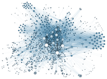
While this method makes it hard to view the path of the nodes, there are no line crossings, which in a large and highly connected network can quickly become too cluttered.
[37] Comparison infographics are a type of visual representation that focuses on comparing and contrasting different elements, such as products, services, options, or features.
Comparison infographics can be highly effective in simplifying complex data and highlighting key differences between multiple items.