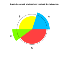
Pie chart
In a pie chart, the arc length of each slice (and consequently its central angle and area) is proportional to the quantity it represents.
The earliest known pie chart is generally credited to William Playfair's Statistical Breviary of 1801, in which two such graphs are used.
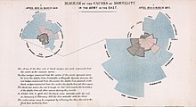
[10] Florence Nightingale may not have invented the pie chart, but she adapted it to make it more readable, which fostered its wide use, still today.
[12] Nightingale's polar area diagram,[13]: 107 or occasionally the Nightingale rose diagram, equivalent to a modern circular histogram, to illustrate seasonal sources of patient mortality in the military field hospital she managed, was published in Notes on Matters Affecting the Health, Efficiency, and Hospital Administration of the British Army and sent to Queen Victoria in 1858.
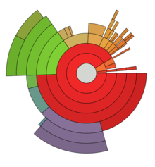
[citation needed] This type of circular graph can support multiple statistics at once and it provides a better data intensity ratio to standard pie charts.
The first known use of polar area diagrams was by André-Michel Guerry, which he called courbes circulaires (circular curves), in an 1829 paper showing seasonal and daily variation in wind direction over the year and births and deaths by hour of the day.
The second set is represented by the superimposed polar area chart, using the same angles as the base, and adjusting the radii to fit the data.
For example, the base pie chart could show the distribution of age and gender groups in a population, and the overlay their representation among road casualties.
Age and gender groups that are especially susceptible to being involved in accidents then stand out as slices that extend beyond the original pie chart.
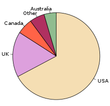
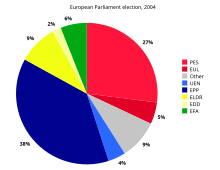
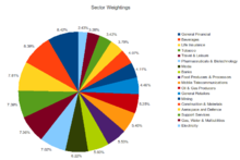
The table lists the number of seats allocated to each party group, along with the derived percentage of the total that they each make up.
In the example, the central angle for the largest group (European People's Party (EPP)) is 135.7° because 0.377 times 360, rounded to one decimal place, equals 135.7.
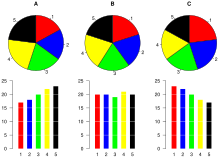
A flaw exhibited by pie charts is that they cannot show more than a few values without separating the visual encoding (the “slices”) from the data they represent (typically percentages).
[7] Statisticians generally regard pie charts as a poor method of displaying information, and they are uncommon in scientific literature.
[25][26] In a pie chart with many section, several values may be represented with the same or similar colors, making interpretation difficult.