Scientific visualization
[6] Notable early two-dimensional examples include the flow map of Napoleon's March on Moscow produced by Charles Joseph Minard in 1869;[2] the "coxcombs" used by Florence Nightingale in 1857 as part of a campaign to improve sanitary conditions in the British Army;[2] and the dot map used by John Snow in 1855 to visualise the Broad Street cholera outbreak.
The primary methods for visualizing two-dimensional (2D) scalar fields are color mapping and drawing contour lines.
2D vector fields are visualized using glyphs and streamlines or line integral convolution methods.
Visual representations and interaction techniques take advantage of the human eye's broad bandwidth pathway into the mind to allow users to see, explore, and understand large amounts of information at once.
Some examples are graphical representations of data for business, government, news and social media.
The model is a description of three-dimensional objects in a strictly defined language or data structure.
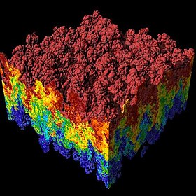
A typical 3D data set is a group of 2D slice images acquired by a CT or MRI scanner.
According to Rosenblum (1994) "volume visualization examines a set of techniques that allows viewing an object without mathematically representing the other surface.
Many volume visualization algorithms are computationally expensive and demand large data storage.
Advances in hardware and software are generalizing volume visualization as well as real time performances".
Developments of web-based technologies, and in-browser rendering have allowed of simple volumetric presentation of a cuboid with a changing frame of reference to show volume, mass and density data.
The featured image shows a plot of a DEM dataset containing mountainous areas near Dunsmuir, CA.
Scientific visualization of mathematical structures has been undertaken for purposes of building intuition and for aiding the forming of mental models.
Instead, colour vision is exploited to capture dimensional information using techniques such as domain coloring.
The imaging is part of the work on the NSF-funded Electronic Visualization Laboratory at the University of Illinois at Chicago.
Image annotations: The featured plot shows Leaf Area Index (LAI), a measure of global vegetative matter, from a NetCDF dataset.
The Scatter plot takes multiple scalar variables and uses them for different axes in phase space.
VisIt can read a limited subset of NASTRAN bulk data files, in general enough to import model geometry for visualization.