Typography
This is an accepted version of this page Typography is the art and technique of arranging type to make written language legible, readable and appealing when displayed.
[1] The term typography is also applied to the style, arrangement, and appearance of the letters, numbers, and symbols created by the process.
As the capability to create typography has become ubiquitous, the application of principles and best practices developed over generations of skilled workers and professionals has diminished.
[6] Although typically applied to printed, published, broadcast, and reproduced materials in contemporary times, all words, letters, symbols, and numbers written alongside the earliest naturalistic drawings by humans may be called typography.
The uneven spacing of the impressions on brick stamps found in the Mesopotamian cities of Uruk and Larsa, dating from the second millennium B.C., may be evidence of type, wherein the reuse of identical characters was applied to create cuneiform text.
[9][10][11] It has been proposed that Roman lead pipe inscriptions were created with movable type printing,[12][13][14] but German typographer Herbert Brekle recently dismissed this view.
[15] The essential criterion of type identity was met by medieval print artifacts such as the Latin Pruefening Abbey inscription of 1119 that was created by the same technique as the Phaistos Disc.
[33] Although typography has evolved significantly from its origins, it is a largely conservative art that tends to cleave closely to tradition.
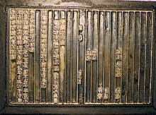
In the nascent stages of European printing, the typeface (blackletter, or Gothic) was designed in imitation of the popular hand-lettering styles of scribes.
[35] Initially, this typeface was difficult to read, because each letter was set in place individually and made to fit tightly into the allocated space.
[34] During the Renaissance period in France, Claude Garamond was partially responsible for the adoption of Roman typeface that eventually supplanted the more commonly used Gothic (blackletter).
Experimental typography is said to place emphasis on expressing emotion, rather than having a concern for legibility while communicating ideas, hence considered bordering on being art.
Traditionally, text is composed to create a readable, coherent, and visually satisfying block of type that works invisibly, without the awareness of the reader.
Contemporary books are more likely to be set with state-of-the-art "text romans" or "book romans" typefaces with serifs and design values echoing present-day design arts, which are closely based on traditional models such as those of Nicolas Jenson, Francesco Griffo (a punchcutter who created the model for Aldine typefaces), and Claude Garamond.
In typesetting, color is the overall density of the ink on the page, determined mainly by the typeface, but also by the word spacing, leading, and depth of the margins.
Readability refers to how easy it is to read the text as a whole, as opposed to the individual character recognition described by legibility.
Justified copy must be adjusted tightly during typesetting to prevent loss of readability, something beyond the capabilities of typical personal computers.
Other topics, such as justified vs. unjustified type, use of hyphens, and proper typefaces for people with reading difficulties such as dyslexia, continue to be debated.
For example, Miles Tinker, who published numerous studies from the 1930s to the 1960s, used a speed of reading test that required participants to spot incongruous words as an effectiveness filter.
The Readability of Print Unit at the Royal College of Art under Professor Herbert Spencer with Brian Coe and Linda Reynolds[48] did important work in this area.
The use of all-caps renders words indistinguishable as groups, all letters presenting a uniform line to the eye, requiring special effort for separation and understanding.
], legibility research tends to be limited to critical issues or the testing of specific design solutions (for example, when new typefaces are developed).
Some typographers believe that the overall word shape (Bouma) is essential in readability and that the theory of parallel letter recognition is wrong, less important, or not the entire picture.
By formulating a style guide, a publication or periodical standardizes with a relatively small collection of typefaces, each used for specific elements within the publication, and makes consistent use of typefaces, case, type sizes, italic, boldface, colors, and other typographic features such as combining large and small capital letters together.
Especially on the front page of newspapers and on magazine covers, headlines often are set in larger display typefaces to attract attention, and are placed near the masthead.
The typographer would also employ larger type for the title to convey its importance, which directly informs the reader of the structure in which the text is intended to be read, and increases readability from varying distances.
Overuse of design elements such as colors and typefaces can be unsettling, preventing the text from conveying its message to readers.
[50] A study from 2020 found that the participating subjects felt music sounded "more pleasant" when the CD cover featured round typeface.
Designers often use typefaces to set a theme and mood in an advertisement (for example, using bold, large text to convey a particular message to the reader).
The widespread use of the computer and various etching and sandblasting techniques today has made the hand carved monument a rarity, and the number of letter-carvers left in the US continues to dwindle.