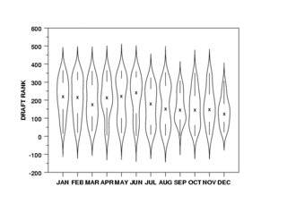
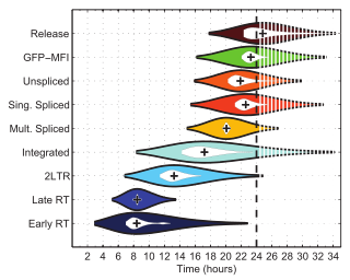
Violin plot
A violin plot is a statistical graphic for comparing probability distributions.
A violin plot will include all the data that is in a box plot: a marker for the median of the data; a box or marker indicating the interquartile range; and possibly all sample points, if the number of samples is not too high.
In this case a violin plot shows the presence of different peaks, their position and relative amplitude.
The next layer (if it exists) inside might represent the values that occur 50% of the time.
[3][4] This article incorporates public domain material from Dataplot reference manual: Violin plot.