Box plot
In descriptive statistics, a box plot or boxplot is a method for demonstrating graphically the locality, spread and skewness groups of numerical data through their quartiles.
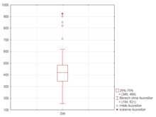
Outliers that differ significantly from the rest of the dataset[2] may be plotted as individual points beyond the whiskers on the box-plot.
Box plots are non-parametric: they display variation in samples of a statistical population without making any assumptions of the underlying statistical distribution[3] (though Tukey's boxplot assumes symmetry for the whiskers and normality for their length).
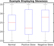
The spacings in each subsection of the box-plot indicate the degree of dispersion (spread) and skewness of the data, which are usually described using the five-number summary.
[5] The box-and-whisker plot was first introduced in 1970 by John Tukey, who later published on the subject in his book "Exploratory Data Analysis" in 1977.
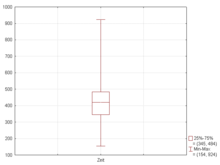
[6] A boxplot is a standardized way of displaying the dataset based on the five-number summary: the minimum, the maximum, the sample median, and the first and third quartiles.
Some box plots include an additional character to represent the mean of the data.
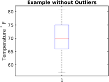
This can be appropriate for sensitive information to avoid whiskers (and outliers) disclosing actual values observed.
If the data are normally distributed, the locations of the seven marks on the box plot will be equally spaced.
A popular convention is to make the box width proportional to the square root of the size of the group.
[12] The width of the notch is arbitrarily chosen to be visually pleasing, and should be consistent amongst all box plots being displayed on the same page.
The first quartile value (Q1 or 25th percentile) is the number that marks one quarter of the ordered data set.
The first quartile value can be easily determined by finding the "middle" number between the minimum and the median.
The third quartile value (Q3 or 75th percentile) is the number that marks three quarters of the ordered data set.
The third quartile value can be easily obtained by finding the "middle" number between the median and the maximum.
Similarly, the lower whisker boundary of the box plot is the smallest data value that is within 1.5 IQR below the first quartile.
First, the box plot enables statisticians to do a quick graphical examination on one or more data sets.
Box-plots also take up less space and are therefore particularly useful for comparing distributions between several groups or sets of data in parallel (see Figure 1 for an example).
Although looking at a statistical distribution is more common than looking at a box plot, it can be useful to compare the box plot against the probability density function (theoretical histogram) for a normal N(0,σ2) distribution and observe their characteristics directly (as shown in Figure 7).