Radar chart
The relative position and angle of the axes is typically uninformative, but various heuristics, such as algorithms that plot data as the maximal total area, can be applied to sort the variables (axes) into relative positions that reveal distinct correlations, trade-offs, and a multitude of other comparative measures.
The star plot can be used to answer the following questions:[5] Radar charts are a useful way to display multivariate observations with an arbitrary number of variables.
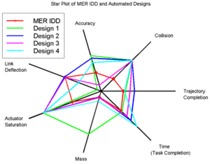
If a batter is shown to hit poorly against left-handed pitching, then his team knows to limit his plate appearances against left-handed pitchers, while the opposing team may try to force a situation where the batter is forced to hit against the pitcher.Another application of radar charts is the control of quality improvement to display the performance metrics various objects including computer programs,[12] computers, phones, vehicles, and more.
A programmer could gather up several different sorting algorithms such as selection, bubble, and quick, then analyze the performance of these algorithms by measuring their speed, memory usage, and power usage, then graph these on a radar chart to see how each sort performs under various sizes of data.
They could then graph the results using a radar chart to see the spread of variables and find how the differ, such as one anti-depressant being cheaper and quicker acting, but not having great relief over time.
Radar charts can be used to graph the variables of life affecting a person's wellness, and then be analyzed to help them.
A more specific example is in the case of athletes, whose various wellness habits such as sleep, diet, and stress are monitored to make sure they stay in peak physical condition.
[14] If any areas would be shown dipping, doctors and trainers could step in to assist the athlete and improve their wellness.
[21] We will use this table below to create Radar charts comparing the 2021 MVP batting stats to the league averages for Designated Hitters and regular batters, in an attempt to visualize performance metrics and visually come to a conclusion that Shohei out performed the average player.
Next we will include additional samples into the Radar chart, using Hall of Fame players Jackie Robinson, Jim Thome, and Frank Thomas to compare Shohei to a few of the greatest batters of all time.
We can see in Figure 10 how a radar chart can be easily interpreted when the number of spokes and samples is relatively small.
When we compare more samples in Figure 11, even without an area fill on the radar chart, it becomes apparent how difficult it can become to interpret or make trade-off decisions.
The AMC models tend to be inexpensive, have below average gas mileage, and are small in both height and weight and in roominess.
For graphical qualitative comparison of 2-dimensional tabular data in several variables, a common alternative are Harvey balls, which are used extensively by Consumer Reports.
[23] An excellent way for visualising structures within multivariate data is offered by principal component analysis (PCA).