Weather map
Isotach maps, analyzing lines of equal wind speed,[3] on a constant pressure surface of 300 or 250 hPa show where the jet stream is located.
Cloud codes are translated into symbols and plotted on these maps along with other meteorological data that are included in synoptic reports sent by professionally trained observers.
The use of weather charts in a modern sense began in the middle portion of the 19th century in order to devise a theory on storm systems.
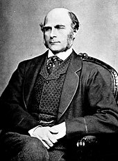
In England, the scientist Francis Galton heard of this work, as well as the pioneering weather forecasts of Robert FitzRoy.
He used his map to prove that air circulated clockwise around areas of high pressure; he coined the term 'anticyclone' to describe the phenomenon.
[5] The introduction of country-wide weather maps required the existence of national telegraph networks so that data from across the country could be gathered in real time and remain relevant for all analysis.
In the US, The Smithsonian Institution developed its network of observers over much of the central and eastern United States between the 1840s and 1860s once Joseph Henry took the helm.
[7] The U.S. Army Signal Corps inherited this network between 1870 and 1874 by an act of Congress, and expanded it to the west coast soon afterwards.
Polar front theory is attributed to Jacob Bjerknes, derived from a coastal network of observation sites in Norway during World War I.
[11] The United States began to formally analyze fronts on surface analyses in late 1942, when the WBAN Analysis Center opened in downtown Washington, D.C.[12] In addition to surface weather maps, weather agencies began to generate constant pressure charts.
[19] Recent advances in both the fields of meteorology and geographic information systems have made it possible to devise finely tailored products that take us from the traditional weather map into an entirely new realm.
Maps filled with dense station-model plots can be difficult to read, but they allow meteorologists, pilots, and mariners to see important weather patterns.
A completed station-model map allows users to analyze patterns in air pressure, temperature, wind, cloud cover, and precipitation.
Because of the structure of the SYNOP code, a maximum of three cloud symbols can be plotted for each reporting station that appears on the weather map.
[24][25] The symbol used on the map for each of these étages at a particular observation time is for the genus, species, variety, mutation, or cloud motion that is considered most important according to criteria set out by the World Meteorological Organization (WMO).
Areas with small dewpoint depressions and are below freezing indicate the presence of icing conditions for aircraft.
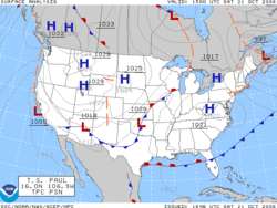
Isobaric analysis is performed on these maps, which involves the construction of lines of equal mean sea level pressure.
The innermost closed lines indicate the positions of relative maxima and minima in the pressure field.
[32] Isobars are commonly used to place surface boundaries from the horse latitudes poleward, while streamline analyses are used in the tropics.