Thematic map
This usually involves the use of map symbols to visualize selected properties of geographic features that are not naturally visible, such as temperature, language, or population.
[1] In this, they contrast with general reference maps, which focus on the location (more than the properties) of a diverse set of physical features, such as rivers, roads, and buildings.
Several types of thematic maps have been invented, starting in the 18th and 19th centuries, as large amounts of statistical data began to be collected and published, such as national censuses.
A wide variety of phenomena and data can thus be visualized using thematic maps, including those from the natural world (e.g., climate, soils) and the human world (e.g., demographics, public health) According to Arthur Robinson, thematic maps were largely an Industrial Age innovation, with some Enlightenment-era roots; almost all of the modern graphical techniques were invented between 1700 and 1850.
Their accuracy improved slowly, and even in the mid-17th century, they were usually of poor quality; but they were good enough to display basic information, allowing the production of the first thematic maps.
[6]: 42 His first significant cartographic contribution was a star chart of the constellations of the Southern Hemisphere, made during his stay on St. Helena and published in 1686.
Early chorochromatic (nominal area-class) maps also appeared in the late 18th century as scientific instruments for exploring geographic phenomena such as geology and language.
[6]: 52 The early to middle 19th century could be considered, as Robinson called it, a "golden age" of thematic mapping, when many of the current techniques were invented or further developed.
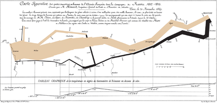
[11] One of the most influential early works of thematic cartography was a small booklet of five maps produced in 1837 by Henry Drury Harness as part of a government report on the potential for construction of railroads in Ireland.
[15] Their popularity vastly increased in the second half of the century, due to several influences: first, the Quantitative revolution in geography and the rise of cartography as an academic discipline, both of which increased the role of thematic maps as tools for scientific analysis and communication; second, technology that facilitates map design and production, especially the personal computer, the geographic information system (GIS), graphics software, and the Internet; and third, the widespread availability of large volumes of data, notably the first digital releases of national censuses in the 1990s.
Sometimes this distribution is already familiar to the cartographer, who wants to communicate it to an audience, while at other times the map is created to discover previously unknown patterns (as a form of Geovisualization).
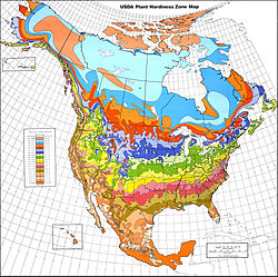
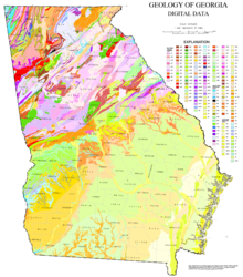
Common examples include maps of surface geology, soil, vegetation, land use, city zoning, and climate type.
But instead of mapping the data so that the region appears uniform, ancillary information is used to estimate a more detailed distribution of the phenomenon within each enumeration unit.
For example, land cover data (forest, water, grassland, urbanization) may be used to refine the distribution of county-level population density.
These layers play a secondary role in the use of the map, so they are usually included sparingly, and symbolized to be low in the visual hierarchy, but not so faded that they cannot be used.