Letter case
The two case variants are alternative representations of the same letter: they have the same name and pronunciation and are typically treated identically when sorting in alphabetical order.
By virtue of their visual impact, this made the term majuscule an apt descriptor for what much later came to be more commonly referred to as uppercase letters.
In scripts with a case distinction, lowercase is generally used for the majority of text; capitals are used for capitalisation and emphasis when boldface is not available.
[citation needed] Capitalisation in English, in terms of the general orthographic rules independent of context (e.g. title vs. heading vs. text), is universally standardised for formal writing.
In some traditional forms of poetry, capitalisation has conventionally been used as a marker to indicate the beginning of a line of verse independent of any grammatical feature.
In political writing, parody and satire, the unexpected emphasis afforded by otherwise ill-advised capitalisation is often used to great stylistic effect, such as in the case of George Orwell's Big Brother.
[13] On the other hand, in some languages it is customary to capitalise formal polite pronouns, for example De, Dem (Danish), Sie, Ihnen (German), and Vd or Ud (short for usted in Spanish).
Informal communication, such as texting, instant messaging or a handwritten sticky note, may not bother to follow the conventions concerning capitalisation, but that is because its users usually do not expect it to be formal.
[9] Similar orthographic and graphostylistic conventions are used for emphasis or following language-specific or other rules, including: In English, a variety of case styles are used in various circumstances: In English-language publications, various conventions are used for the capitalisation of words in publication titles and headlines, including chapter and section headings.
An example of a global publisher whose English-language house style prescribes sentence-case titles and headings is the International Organization for Standardization (ISO).
[citation needed] For publication titles it is, however, a common typographic practice among both British[24] and U.S. publishers to capitalise significant words (and in the United States, this is often applied to headings, too).
For example, R. M. Ritter's Oxford Manual of Style (2002) suggests capitalising "the first word and all nouns, pronouns, adjectives, verbs and adverbs, but generally not articles, conjunctions and short prepositions".
The rules which prescribe which words to capitalise are not based on any grammatically inherent correct–incorrect distinction and are not universally standardised; they differ between style guides, although most style guides tend to follow a few strong conventions, as follows: Title case is widely used in many English-language publications, especially in the United States.
Single-word proper nouns are capitalised in formal written English, unless the name is intentionally stylised to break this rule (such as e e cummings, bell hooks, eden ahbez, and danah boyd).
Often the rules for "title case" (described in the previous section) are applied to these names, so that non-initial articles, conjunctions, and short prepositions are lowercase, and all other words are uppercase.
[27] For example: For the purpose of clarity, the symbol for litre can optionally be written in upper case even though the name is not derived from a proper noun.
They generally separate their syntactic tokens by simple whitespace, including space characters, tabs, and newlines.
Understandably then, such coding conventions are highly subjective, and can lead to rather opinionated debate, such as in the case of editor wars, or those about indent style.
(Some old character-encoding systems, such as the Baudot code, are restricted to one set of letters, usually represented by the upper-case variants.)
The conversion of letter case in a string is common practice in computer applications, for instance to make case-insensitive comparisons.
Many high-level programming languages provide simple methods for case conversion, at least for the ASCII character set.
For example, user passwords are generally case sensitive in order to allow more diversity and make them more difficult to break.
As briefly discussed in Unicode Technical Note #26,[34] "In terms of implementation issues, any attempt at a unification of Latin, Greek, and Cyrillic would wreak havoc [and] make casing operations an unholy mess, in effect making all casing operations context sensitive […]".
Therefore, the corresponding Latin, Greek and Cyrillic upper-case letters (U+0042, U+0392 and U+0412, respectively) are also encoded as separate characters, despite their appearance being identical.
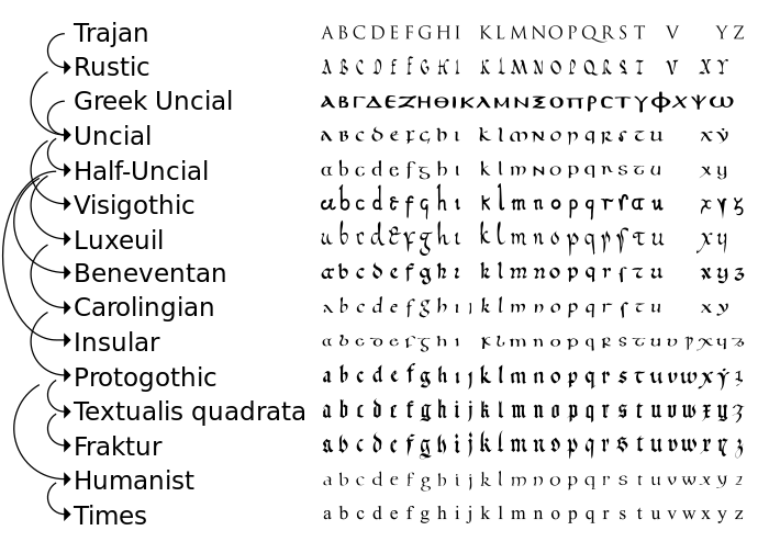
Originally alphabets were written entirely in majuscule letters, spaced between well-defined upper and lower bounds.
[35] These in turn formed the foundations for the Carolingian minuscule script, developed by Alcuin for use in the court of Charlemagne, which quickly spread across Europe.
[citation needed] In Latin, papyri from Herculaneum dating before 79 CE (when it was destroyed) have been found that have been written in old Roman cursive, where the early forms of minuscule letters "d", "h" and "r", for example, can already be recognised.
"[36] Both majuscule and minuscule letters existed, but the difference between the two variants was initially stylistic rather than orthographic and the writing system was still basically unicameral: a given handwritten document could use either one style or the other but these were not mixed.
[38] The modern practice of capitalising the first letter of every sentence seems to be imported (and is rarely used when printing Ancient Greek materials even today).
[citation needed] The Oxford Universal Dictionary on Historical Advanced Proportional Principles (reprinted 1952) indicates that case in this sense (referring to the box or frame used by a compositor in the printing trade) was first used in English in 1588.


 .
.